the same but different, something new
In May of this year I wrote:
I don't have a lot to say about the drawings themselves. I make them. I usually publish them somewhere. I do it again. Five years later there are almost a thousand of them.
Recently, I've been thinking about selling those drawings. The point of doing the work (making the drawings) is to do the work and not necessarily to sell the work. It would be nice to sell the work, to know that the work has found a home where it will be appreciated and to have that work pay some of the bills. I've also been thinking about selling digital prints of some of the drawings. More than anything that's what this blog post is about because I want to have something to point people to when I tell them, or they ask why, the prints are different from the original drawings.
In between giving away artwork for free and the astronomical amounts of money spent on individual works at high-end auctions and a few select commercial galleries is the vast grey area where the economics of making and selling art don't always make sense. More often that not it costs more to produce most works of art, measured in time and materials and so-called opportunity costs
, than they are ever sold for in an artist's lifetime. Even then, even when priced as modestly as an artist imagines possible the work remains beyond the means of many.
I think this is one reason why the idea of prints, and print-making, is so popular. It is the intersection, however brief, between the craft of an individual and mechanical reproduction. The intersection between effort and reward and availability and reach and audience.
I don't necessarily believe in the primacy of the object but I do believe in the value of an object, and especially intentional objects. That's an unfashionable opinion in some circles and lots of people think it is outmoded and naive in a world of deep fakes, style transfers and generative mimicry. People have also been saying painting is dead for something like six thousand years and that's clearly not the case so I think there's room for everyone to be a little bit right and little bit wrong about this subject.
The challenge of any print not created on the transfer medium itself is one of translation, one that usually feels like an exercise in getting lost in translation
. I haven't found any satifying way of capturing the qualities that I appreciate about my drawings, whether its the tenor of the ink, the tone of the paper, the depth of a brush stroke or any of the other physical properties of the work with a camera. In 2020 the long-standing problem of how to account for lighting conditions is exascerbated by so-called computational photography applications having an opinion about things and not offering much in the way of recourse. The ur-example of this, so far, are the stories of people in San Francisco taking pictures of the orange skies caused by the wild fires only to have those skies auto-corrected
in to a pedestrian overcast grey by their phones.
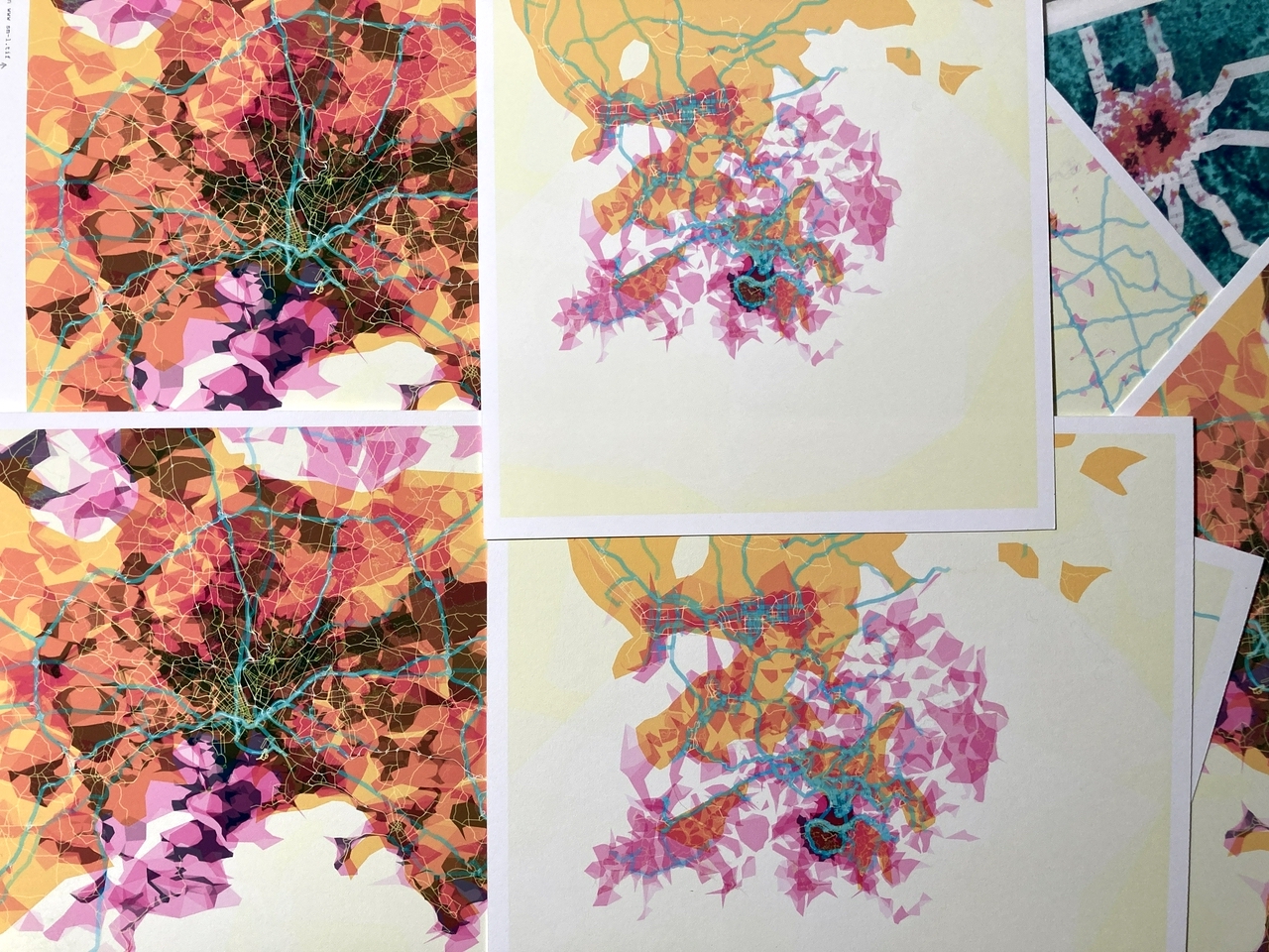
Even producing prints from purely digital works, like prettymaps, is difficult since it involves translating colours produced by light in to colours produced by pigment, a process that is compounded by how those colours sits on or are absorbed by the material they are applied to. Here's a picture of one of the proofs of the prettymaps installation made for the Talk To Me show, printed on a rubbery matte surface that refracts light as though it were passing through Jell-O. I especially like this picture because I still thought I could convince the curator and designers to change the background colour of the exhibition walls from orange to white.
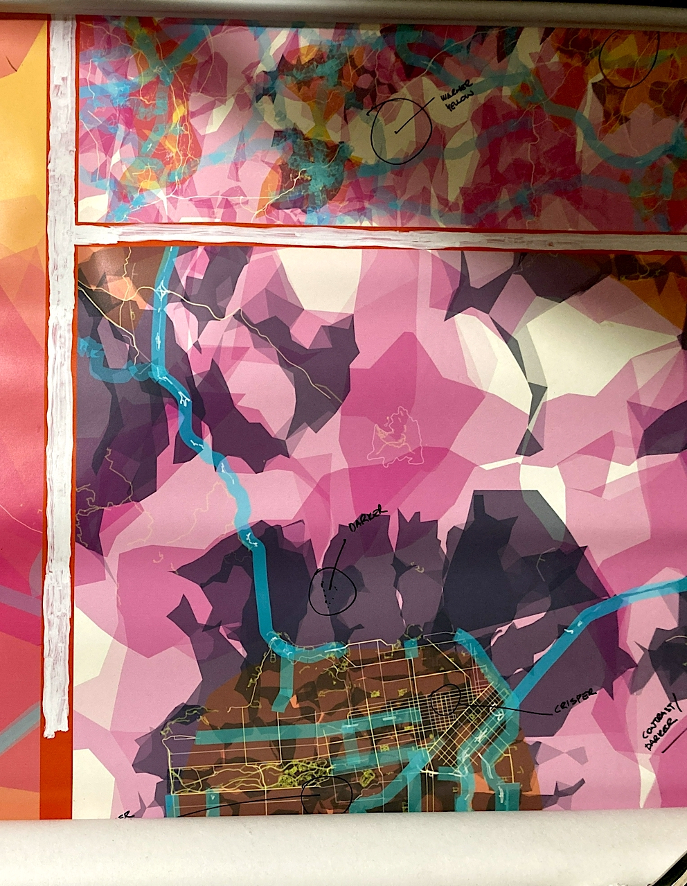
I went through a similar process for every single prettymaps edition produced for 20x200. I think after an initial round of proofing any additional time came out of my cut of the proceeds and the whole process was instructive since I think there was an expectation, on everyone's part, that we could apply the same digital-to-print settings for any part of the world. The reality governed by the unique combination of shapes and colours produced by different areas of the map proved otherwise.
Rather than twisting myself in knots trying to make faithful
images of the work I've been trying to think about how to make prints of a drawing that are clearly derived from the original but just as clearly their own distinct work. This is what I've settled on, at least for now:
- The prints will be larger than the original drawing.
- The prints will be black and white, vectorized representations of the original drawing.
- The prints will be available in small runs, probably no more than three to ten prints in an edition.
- The prints will be
digitally
printed.
The prints are digital, as in they are printed on a fancy inkjet printer. I would actually prefer to screen print them on paper because of the quality of the ink and the way it sits on the paper but I don't have the means, or the time, to do that yet.
It would not be unfair to say that limiting the number of prints in an edition is, in its own way, pretty undemocratic and perpetuates a model of manufactured scarcity and value that ultimately causes more harm than good. That might be overstating things a bit but it's still an argument with merit and worth discussing. I don't have an answer for this yet so in the meantime maybe I am just part of the problem?
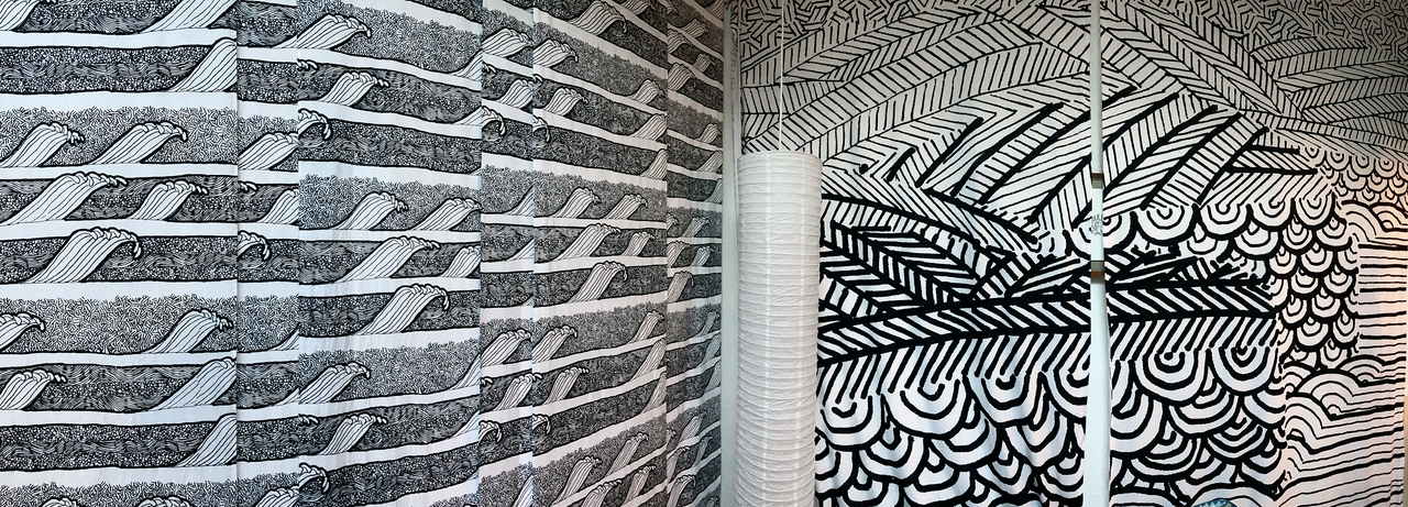
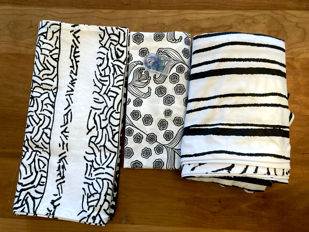
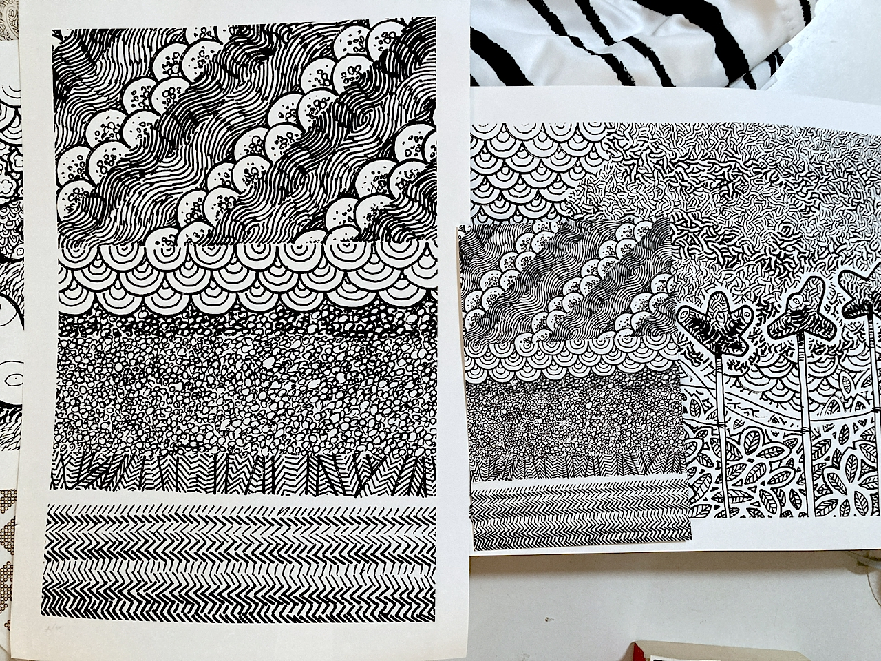
That the prints will be larger than the original drawing is a by-product of the decision to vectorize the drawings and the experience of having some textiles printed from smaller drawings this year. The photograph above shows some fabric I made from an index-card sized drawing and sections of the Mori Point wall hanging I showed in the last blog post. That wall hanging, which measures 13.5 feet by 9 feet was produced from an original drawing that is 9 by 6 inches in size.
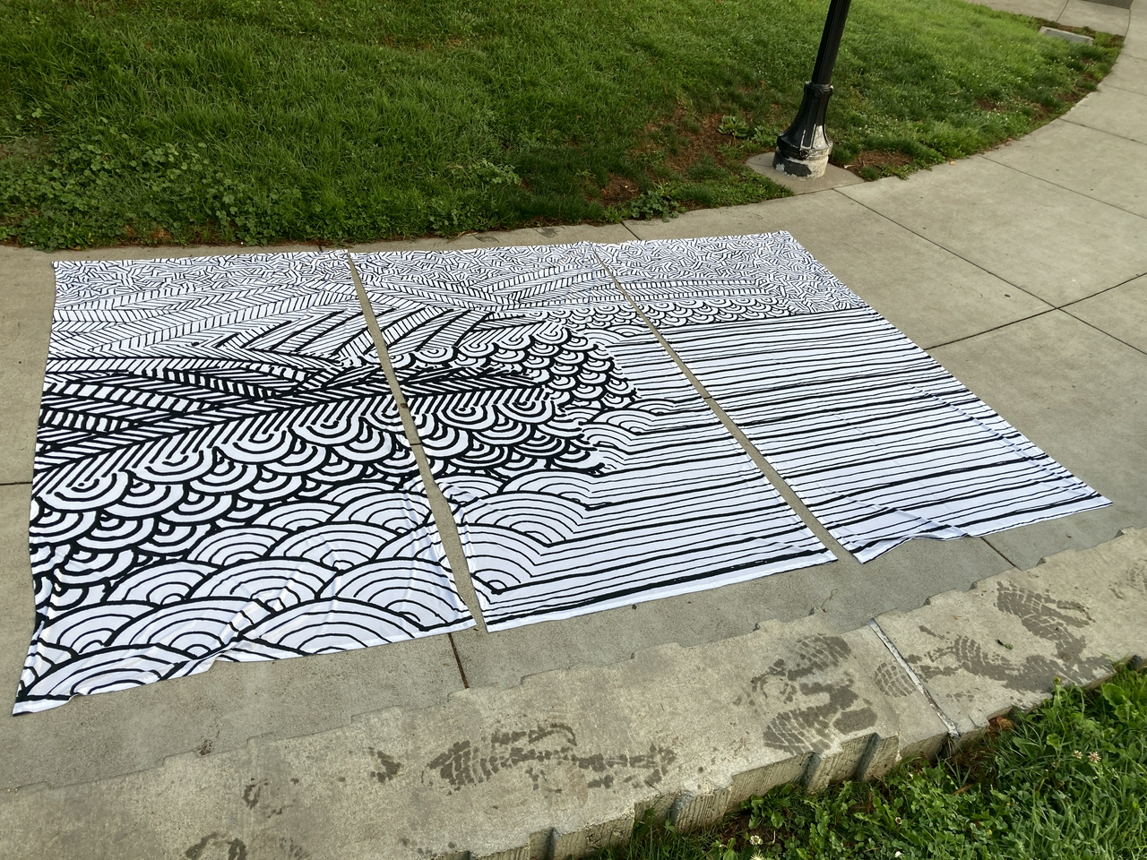
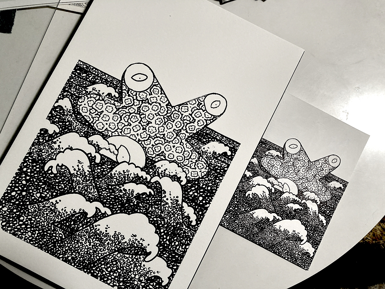
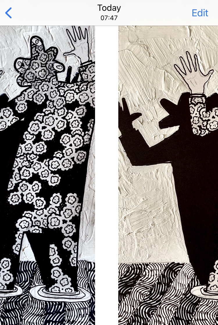
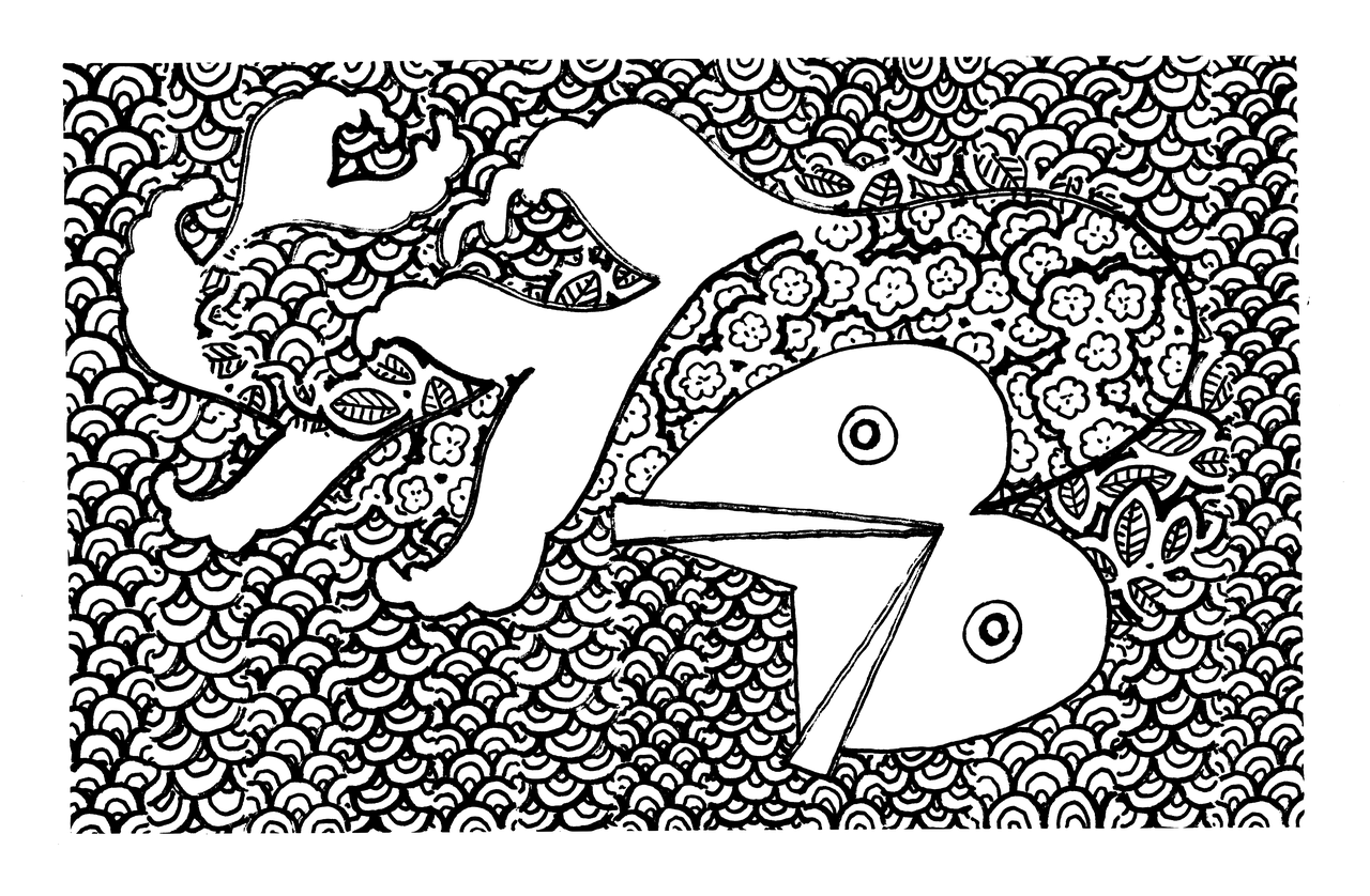
Both of these were done by vectorizing a scan of the orginal drawing which produces a two-tone, simplified representation of the image and then printing it larger the original. The vectorization process is just pixel-counting math whose goal is to create contiguous areas of black or white that are smooth and curvilinear. It's sort of like the maths are playing a game of Othello with a pixelated image and being awarded extra points for avoiding sharp angles. In this way the prints are so much made of math but with math, as though the maths were a finish or a vanish over a painting.
Once vectorized I could make prints of any size but I think I will stick to one size per edition, always larger than the original drawing. I enjoy seeing the over-sized lines and brush strokes, and the spaces between them, that are produced by this process and it signals a clear delineation between the original drawing and the print. They are the same, yet different.
Maybe what I enjoy about these derivative works is that they show me the work I really want to be making but lack the time or the space or the experience to do by hand. Maybe it just demonstrates the direction that the work is moving in regardless. Maybe it is something genuinely novel. What I like most about these prints is the uniformity of application in the way the ink sits on the paper. It is why I want to start producing screen-printed editions. I want to see thick and sticky ink squeezed through a fabric mesh and applied as single, uniform mass with volume and body rather than the fog of a million tiny dots of ink, each clinging to the paper as though they were hanging off the side of a cliff.
That fog of ink, of inkjet printers and inkjet prints, is what I've got right now so it's what I am working with. As with the prettymaps it's not a process that can be applied uniformly with equal success.
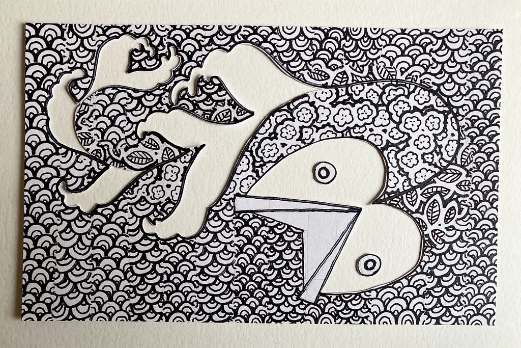
While I was making this drawing it was easy for me to imagine it as a series of prints. I found the reality produced by that idea to be underwhelming. The vectorized print image is a pale shadow of the original drawing, unable to speak for itself. It has a sameness to the original drawing but it is not different in its own right.
That's where things stand today. That is why the print editions are different from the drawings they are derived from. There are a few editions printed and for sale but no place for anyone to purchase them online yet. There will be soon but I am taking each of these steps slowly.
This blog post is full of links.
#same