pocketMMaps (with apologies to Andrew)
I feel kind of bad calling them pocketMMaps
since the name
is only a single, easily overlooked, letter away from the pocketmaps that Andrew and Mikel built for
Mapufacture. By the time it gets beyond being a
0.1 release I may try to find a better moniker
but
since its written in Python and all the Papernet-related software has a tradition of
stupid naming conventions second only to Python itself I
figured: Why not?
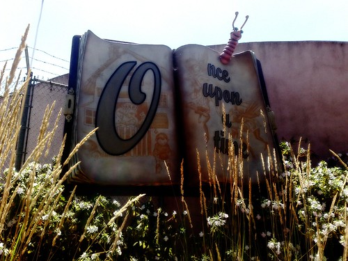
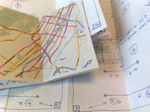
pocketMMaps is software for creating PocketMod-style books for a map image too large to fit on a single page. Maps are generated dynamically and then sliced in to (PocketMod) page-sized pieces and re-arranged on multiple sheets of paper so that when printed and folded you get a little book with the map laid out in handy 2-page spreads. Just like the maps you see in the back of travel guides. It may seem as though I have an obsession with destroying the travel book industry but I don't, really. It's just that their maps suck and their books are too big to fit in my back pocket.
It works like this:
height = 11
width = 8.5
margin = .25
dpi = 144
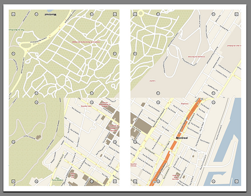
bbox = (45.482882,-73.619899,45.532687,-73.547801)
zoom = 16
out = "montreal_pocketmmap.pdf"
pm = pocketMMap(height, width, margin, dpi)
pm.load_provider('OPEN_STREET_MAP')
pm.draw(bbox, zoom)
pm.save(out)
When you're done, you end up with a PDF file.
pocketMMaps are built on the shoulders of ModestMaps and ws-compose, hence the MM-iness of the naMMe. Sooner rather than eventually I plan to import the code in to the ModestMaps Python trunk but it is still very early days feature-wise. The current short list looks something like this:
- Add support for markers, dots, pinwins, etc. and
reference indexes just like the
original
pocketnet
and ws-modestmaps libraries. - Wrapper code, or libraries, to generate a map and plot points from a source KML, GeoRSS, whatever file just like the orginal mmPDF.php library. Hello, Dopplr tips...
- Better font handling and sizing with an eye towards optionally using PIL so that pycairo is not a dependency.
- Try and reconcile some of the more eggregious uses of
lib_copy_and_pasteback in to either the wscompose or ModestMaps branches. - Tangentially related, writing bloody setup.py files for all the stuff in the ModestMaps Python trunk so you don't have to run everything out of the same folder.
- Support for the Metric system because, you know, the whole world uses it.
- Work out the gotchas and best practices for especially large maps that span many sheets of paper. Experience shows that a PocketMod book with more than five nested sheets of paper kind of sucks.
- ws-pocketmmap.
In the meantime, if you are planning to spend the day wandering around a new and unfamiliar neighbourhood and just want a simple map to print out and take with you, well, now you can.
Ladies and gentlemen, pocketMMap.py 0.1
This blog post is full of links.
#pocketmmaphttp://icanhaz.com/flosm

No, really.
This blog post is full of links.
#flosmDispatches From A Town Called Patience
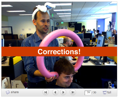
Depending on how charitable you are feeling corrections
in Flickr are either an admission of
failure or
an embrace of everything good about community-driven data and
neo-geography.
A little bit of history:
The next two slides go on to say You
won't get more precise than neighbourhood
followed by
the even more depressing Turning coordinates into
something useful is hard
. I don't remember how long it
had been since we'd finally stopped displaying
neighbourhoods for geotagged photos on Flickr when Paul
gave that presentation but it highlighted why we
did.
The reality is that we have always been surprisingly
successful at determining a photo's neighbourhood but
there have also always been mistakes and no one is very
tolerant of mistakes about place
. Between
plane-living and the
Internets we may be midway
through the process of distilling every place on Earth down
to one
of a half-dozen archetypal city-states but until that
happens trying to affect a person's relationship to the history
and geography of whatever piece of dirt they call home will
continue to be a source of tension.
Or, if you went to ETech in 2007, being told your photos were taken in the San Diego County Jail. In a note to the W3C's mailing list on geolocation APIs on the subject of reverse-geocoding, I wrote:
There is always going to be a bias of interpretation in the hierarchy of relationships you choose. This is okay, really.
The simplest example is to contrast the way that Flickr and FireEagle handle
localitiessince the two sites share an almost exact hierarchy of places. Flickr treats anything with neighbourhoods as a locality so in our model Duncans Mills, CA (pop. 84) and Mexico City (pop. 19M) are assumed to be the same "type" of place.FireEagle does not. If you authorize an application to know your whereabouts at a
citylevel there is an expectation that your actual location will be suitably fuzzed (assuming that you share an expectation that cities arebig) and in a town of 84 people there's not a lot of room to get fuzzy in.Never mind so-called disputed places (Kashmir, the West Bank, Cyprus, etc.) all neighbourhoods are
disputedaround the edges. (This is often true of localities, as well.)For example, the rough consensus in San Francisco is that Delores street is the dividing line between the Mission and Noe Valley. That said there are those people who may live on the one side of the line and very much believe themselves to be living on the "other". Our experience has been that there are few better ways to pick a fight than to tell someone what neighbourhood they are in (and being wrong).
There is also the problem where the data simply doesn't exist yet or it is just old and dusty, sometimes wrong, and often plain weird : Manhattan Valley, anyone?
Multiply that by 80 million geotagged photos.
This is mostly what Dan and I were talking about when we
two-man-luged our way through a talk about reverse-geocoding
at Where 2.0 this spring : Even if we did have a giant database
mapping every point on the planet (multipled by decimal
degrees, multiplied again by zoom
levels) to a place
people still wouldn't agree on its contents.
As useful as the frustration of having photos geotagged in my aparment show up in Noe Valley was to understanding and improving some of the issues involved in making this stuff work at all there is only so much human subtlety you can, literally, codify in to a computer program.
What if instead of simply trying to keep pace with all of
human history and predujice as a series of cascading
if/else statements we laid our cards —
the places that we think a pair of latitude and longitude
coordinates might be — on the
table and if we get it wrong give people the chance to
tell us what they meant and to learn from that? What if the
next time you geotagged a photo we compared where we think
that place is against the places that you've told us
are nearby? If not you, then your contacts? What if every
single person on Flickr points out that a neighbourhood, or
town, is just plain wrong?
Dan has written a pair of good blog posts describing
the nuts and bolts of how corrections
works and in the nerdier of
the two he sums it up nicely by saying:
On a slightly more philosophical level, it’s a never ending process. We’ll never reach a point where we can say “Right that’s in, all borders between places have been decided”. But what we should end up with are boundaries as defined by Flickr users.
...
For us, it’s a first small step into an experiment, and actually a pretty big experiment as we’re potentially accepting “corrections” from our millions and millions of users. We’re not quite sure how it’ll all turn out, but we’re armed with Maths, Algorithms and kitten photos.
For a lot of reasons (most good, some bad) corrections took a long time to make it out the door. Then again, so did geotagging itself and the important part is that it's out. We haven't deployed any of the code to test for nearby corrections since it's a bit of a chicken and egg problem without, well, corrected data but that should follow soon enough. It's a small thing, more like polish and detailing than a full-on feature, and like machine tags I don't expect people to get excited about it, right away, but once they need it I hope it will shine for them.
And we've started displaying neighbourhoods again.
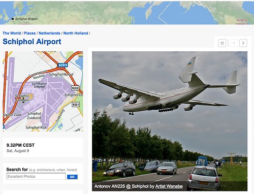
If corrections were difficult to explain to people,
describing the changes to way we handle airports — and
why we should even bother — was often like talking
to people in whale-song. Very quietly, last May, we updated
the reverse-geocoding logic to stop looking for the nearest
town when a photo is geotagged at an airport and instead
treat the airport itself as the town. The Places pages were
all updated accordingly and now you can type in
/places/3-LETTER-AIRPORT-CODE and it will
pretty much do what you expect (barring those places that
need to be corrected, of which there are inevitably a
few).
We did this not (only) because I have long read and admired the work of J.G. Ballard but because it is the right thing to do. Though, administratively, airports are generally associated with a single municipal or regional entity they often serve a range of towns and cities and the realities of contemporary travel mean that they have evolved from being simple gateways to captial-P places with their own culture, norms and gravity.
Whatever an airport may be for accounting
purposes it rarely matches contemporary expectations and experience; no one
wants to see pictures of Hounslow when they go
to London Heathrow
Airport and vice versa. The
latter still happens unfortunately but the hope is that
by adding airport and corrections knobs
(and a few
others still too soon to talk about) that users can adjust
things to their understanding of the world and
we can begin to map facts on the ground rather than from on
high.
This blog post is full of links.
#correctionsHistory Boxes
Two years ago, we went to Europe and when we came back I made a book. Last year, we went to Europe and when we came back I made a book with maps. That was the germ which started Net:Flickr::Geo and later my involvement with Modest Maps.
We went
to Europe again this year and I left knowing that when we got
back I would make
another book, with fancy dithered maps, but
that's as much as I'd thought about it. During the last two trips I
had done a lot of work to position and render multiple images which
ultimately ended with poster maps
, a single large scale
representation of a group of photos. As pleased as I am with poster
maps they are only good when played loud and not necessarily
the best way to share photos from a trip
.
Lack of wall space aside I also don't want to look at this stuff every day let alone be forced to stand up while I'm doing it. Having a book idling around the living room means I can pick it up and poke through while I'm on the phone or carry them in to the kitchen when I am feeling all weepy-eyed and nostaglic.
I also now have three years and just over as many books worth of photos from Europe at this point. Since I am a creature of habit many of the pictures are taken in proximity to one another so I thought it would be nice to create a poster map for a single photo, instead of a photo set, and show it in the nested among all the other photos that I had taken nearby, over time.
Cluster maps for lack of any better name.
I am especially intrigued by the idea of generating cluster maps year over year and watching the spaces that I revisit gradually fill in with the echoes of the past. A sort of slowed down timeline done in book form where jumping through the layers means putting one down one book and picking up another.
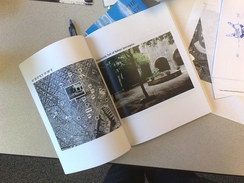
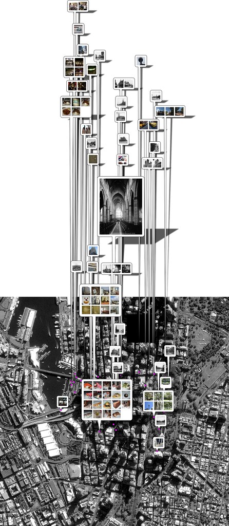
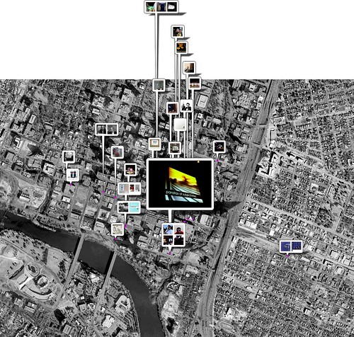
This eventually led to historical
cluster maps, like the one
of the
nave at St. Andrew's cathedral in downtown Sydney shown to your
right. Historical because it blends the results of two queries
for nearby photos. The first, (n) days on either side of when
the source photo was taken. The second, photos taken an equal
numbers of days since right now.
Cluster maps are not really suited to the firehose of photos
available on Flickr since they mostly just end up being as large or
larger than poster maps. As they are also constrained
to a small area geographically (typically a 1km radius) you also run in to the problem
where they are raining
pinwins. What you're seeing in the
cluster map of St. Andrew's are only photos that
properly licensed for this sort of thing so you can imagine
how many photos you'd get if you decided to not play by the
rules (don't do that).
At least not for print, anyway. This sort of thing might
sing in the hands of a good Flash developer. Either way it was a
pleasant exercise in visualizing the history box
that
Flickr has become. It always a bit frustrating talking to people
— especially people who make hardware because that part is
still
honest-to-god hard — and pointing out that if they
sent us a bounding box (via the API) we'd send them pictures! And getting
blank stares.
The thing that's kind of awesome about having 80
million geotagged photos (give or take) most of which are public
at a time when location aware devices are becoming useful enough
to bother carrying around is that every (every
) place on
Earth becomes a kind of Auggie
Wren portal.
If you think relentless chatter about the Papernet is bad I've been obsessed with Paul Auster's story about the shop owner who photographs one corner in Brooklyn every day for 20 years since I read it, well, just about 20 years ago. I love that there is record of a shared experience of place with a complete stranger and I love to see how the contours have expanded and contracted. I love that the network explodes the notion of a photo album in to an omnipresence and allow me to go for a walk with the past and — to simultaneously borrow and abuse Neb's observation — wrap the present in an onion-skin of subjectivities.

Well, that's the idea anyway.
The first pass will probably suck because the current vogue for so-called Hertzian spaces doesn't leave much room for anything except devices (or worse, optical-cum-neuro implants) nevermind the imagination. I had a conversation with Steve Lambert a while back about wanting to something along the lines of the Anti-Advertising Agency, to string up fast and cheap displays aroung the city to show nearby geotagged photos; real-live history boxes. He suggested using white-box ATM machines.
Rather than devices which live in and are always announcing a perpetual present, maybe finding a norm and a practice to give all those dumb terminals that surround us the ability to display an awareness of their environment — nearby geotagged photos or something like a non-creepy version of Leonard's BlueBall hack as quasi screensavers on ATM displays — would be more fun, more compelling and more meaningful than a crush of people bumping in to each other as they awkwardly transpose their personal iPhone space on to the physical world.

Which is a very long way of saying: The first part was to get radial queries working in the Flickr API.
It only took 18 months following the release of geotagging so it is extra wonderful to see it become part of applications like Frasier Spier's Exposure so quickly and Matt and Alex's subsequent comments are the icing on the cake. The iPhone may not save us but we have to start somewhere (the peanut gallery should refer to my comments about hardware vendors above) and this sort of stuff is what makes it all worth it on both the good days and the bad days.
Technically you've always been able to do something like radial queries using plain old bounding boxes but this ignores two truths. First, that bounding boxes are boring when they're not hard. Second, if you wanted to sort by proximity to the center of the box you needed to so manually which meant fetching all the results in advance of doing anything with them (like sorting them by distance). Pagination is hard when it's not boring.
There's a lot to be said for just being able to do this:
my $flickr = Net::Flickr::API->new(...);

my $photos = $flickr->api_call({
	'method' => 'flickr.photos.search',
	'args' => {
        	'lat' => 37.785377, 'lon' => -122.414852,
                'radius' => 2, 'tags' => 'kittens',
                'page' => 1, 'per_page' => 15,
	},
});
With that problem out of the way I started the work of updating Net::Flickr::Geo to fetch and layout all the photos.
The choice to use the square (75 x 75 pixel) thumbnail for nearby photos was largely dictated by proximty of all the images to one another and to limit, as much as possible, the goal of preventing overlaps from sending everything shooting off the map. For that same reason thumbnails that share the same latitude and longitude and clumped together in single pinwin whose size is determined by the square root (and some fussing) of the total number of images.
Like poster maps, cluster maps enforce the
ws-modestmaps bbox method which says: Just get me
all the tiles you need to display this bounding box at this zoom
level. At some point, when there are tiles so granular you could
read the morning's paper on them it should be possible use
larger sized thumbnails and still stay within the map's
canvas
but not yet. There is still a maximum density (or clustering)
after which point the map is dwarfed by the space needed to plot
all the pinwins and there is no room left for anything interesting.
The bounding box used to fetch the tiles is not the circle-squared of the radius but rather the furthest points of the entire result set. This means that the principal photo in a cluster map may not always be centered. I suppose it would easy enough to make this optional but at least in a book context with many cluster maps I like the variety of composition this adds to the collection of images.
All things being equal, that's pretty much all there was to it. Dream up a new layout and ordering for the photos, update the Flickr API (would that it were always so easy) and tweak the code that calls it. Profit!
It's just that when I was generating test maps of photos from
the trip to SXSW this year I couldn't help but
notice (again) how ugly and jaggy
the taller anchors for
the pinwins were. Having long threatened to update ws-modestmaps
to (optionally) use the Python bindings for the Cairo vector
graphics library I figured that if I was going to spend the
money to have a nice book printed I might as well also spend the
time to create properly aliased pinwins.
  22 |# DANGER WILL ROBINSON : YOU ARE ABOUT TO
  23 |# ENCOUNTER CODE THAT WILL MAKE YOU WEEP.
  24 |# I KNOW. I CRY EVERY TIME I LOOK AT IT.
That is from the top of the library that was generating the pinwins when I began. The only kind thing I can say about it is that it somehow managed to work for as long as it has without completely failing. It's two biggest problems were that it was originally developed in tandem with the rest of the ws-modestmaps code and carried all the scars of the many, various attempts to get everything working and was an absolute clusterfuck of best guesses and approximations for generating perspective shadows in the absence of being able to work out the matrix math to do it the right way. Math is hard and I chose to go shopping.
Of course, the first thing I did was try a straight,
brute force, port of all the old cruft to Cairo. This worked
well until I got to the part with the shadows, specifically
rendering the rounded corners in perspective. The problem I've
always had with matrix math (used to calculate all the various
parameters needed to do stuff like a persective transformation)
is the absence of any documentation that doesn't involve Math
Shapes. I can find lots of example code
but it seems to
exist only in a theoritical world where demonstrating the
concepts using actual numbers as inputs and outputs seems to be
tantamount to admitting defeat.
That's the bad news. The worse news was that reproducing the
original pinwin shadow kludge, done using the Python
Imaging Library in pycairo would be even uglier and I
would have to live with the shame of having knowingly littered
the world with such shitty and brittle code not once but
twice. This isn't a I was so dumb back then
scenario but
rather hear no evil, see no evil
material.

After about two weeks of chipping away at a whole series of
mostly incomprehensible matrix-related tutorials
and
one invaluable mailing list message written in plain English
(which I've managed to misplace in the interim) I was able to
glean just enough information to start doing tests where I could
finally see the relationship between all these goofy-ass variables
and the actual thing I was creating.
Because there's a lot to be said for just being able to do this:
m = PinwinMarker(240, 180, 50)
m.cartoon_shadows = False

m.draw()
m.save("pinwin.png")
If you look carefully you may notice that the shadows still seem a little odd near the base of the anchor. That's because one of the side effects of blurring the shadows is that the shadow itself ends up being obliterated as it approaches the point. I decided that it was better to add a little bit of quirkiness (the length of the anchor is extended by some factor of itself before it is blurred) at the base of the anchor rather than having the shadow taper off midway from the canvas which is what happens when you do it the right way.
(You can also choose to disable blurry shadows at which point everything syncs up nices and properly again.)

Having finally acheived a true and proper Googlesthetic (sic) I
ultimately opted to leave the
cartoon
version with their funny butler's platter
on a giraffe's neck shadows as the default. Both
versions now use the same perspective transformation for
the shadow's canvas
(the bit where the image you
want to display is placed) but I still think the
goofy shadows are warmer, less distracting and better
suited for cluster maps where the pinwins are often
floating in whitespace.
Then, just when I though I was done Dan pointed out that the shadow from one pinwin should never fall the anchor of another. Having implemented his suggestion I'm not sure I still agree but it does mean that when you create a pinwin you can ask for any one of three layers: the canvas, the shadow or the two combined. ws-modestmaps does this by default first adding all the shadows and doing a second pass with the pinwin canvases.
You can see the effect above, in the cluster map of Sydney, near the shadow of the cathedral's nave. If you're like me you may find the zebra-striping and the contrast a bit too harsh and be thinking about making it optional in the next code release.
All for a silly photo album. Oh yeah, remember the book?
Finally, something like a month and a half after getting back from Europe I had several hundred test images, a book with cluster maps (and funny bluish shadows because of the way blacks and greys are printed these days) and all the code to generate them committed to the CPAN and the ModestMaps SVN tree. That is:
- Net::Flickr::Geo.pm
0.72 — this contains new methods to
generate cluster maps for a single photo, an
entire photoset or an
historical
cluster map for a photo. - ModestMaps, rev. 637 — this contains no user-facing changes, beside the way the shadows are drawn. Under the hood ws-modestmaps will silently check to see if pycairo is available and use it if it is. The new pinwin code comes with a bunch of knobs and toggles which I would like to expose in ws-modestmaps but that is going to wait until I get around to making the core service WSGI compliant.
Two other packages have been released separately, though they are both installed automatically as a dependency or included by default with the software listed above. They are:
- Net::ModestMaps.pm 1.1 — a simple wrapper object for calling a ws-modestmaps server in Perl (and preventing LWP::UserAgent from freaking out when it's passed several hundred HTTP response headers).
- pwmarker.py 1.0 — all the pinwin code discussed above but packaged independently of Modest Maps. This will work with both the Python Imaging Library or the Python Cairo bindings but in either case requires the former.
Having recently had to rebuild my laptop from scratch I can attest to the part where none of this is a simple one-click install yet. My only defence is that there are only so many hours in the day and these are the stars I am looking at, right now. If it's any help, at least on a Mac it's a reasonably straightforward albeit lengthy process using MacPorts and the CPAN (assuming of course you've also installed the OS X developer tools). These are some of my notes:
# py25-cairo (macports; this will install Python)

# py25-pil (macports)

# libgd2 (macports; this will install Perl for some crazy reason)

# p5-GD (macports)

# p5-XML-LibXML (macports)

# p5-XML-XPath (macports; installs p5-XML-Parser)

# symlink all your Perl and Python related binaries from /opt/local/bin
  to /usr/bin and /usr/local/bin

# Bundle::CPAN (cpan)

# force install Geo::Distance (cpan; there's a bad test that I need to work
  around in N:F:G)

# Net::Flickr::Geo (cpan; installs the remaining Perl modules)
Software is for humans, right?
Meanwhile, while all that was going on Andrew announced that Mapufacture has launched their PocketMaps feature, which will generate mmPDF-style PocketMod booklets for the maps you create on their site. If I ever manage to finish writing this blog post the next bits to bubble to the top of list should start to see a lot of the work described above rolled back in to some of the earlier Papernet begets PocketMod begets *-PDF related projects where all this nonsense started in the first place.
See also: The Tate's Your Collection pamphlets. Because they are fucking awesome, that's why!
This blog post is full of links.
#historybox